Type

Branding . Logo . Product Design

No.

03

Dal Dal

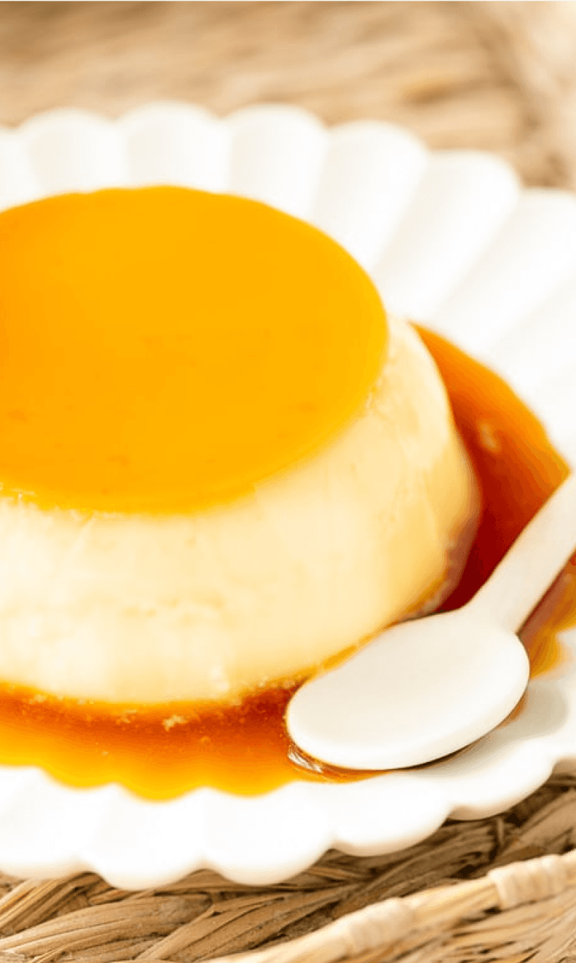
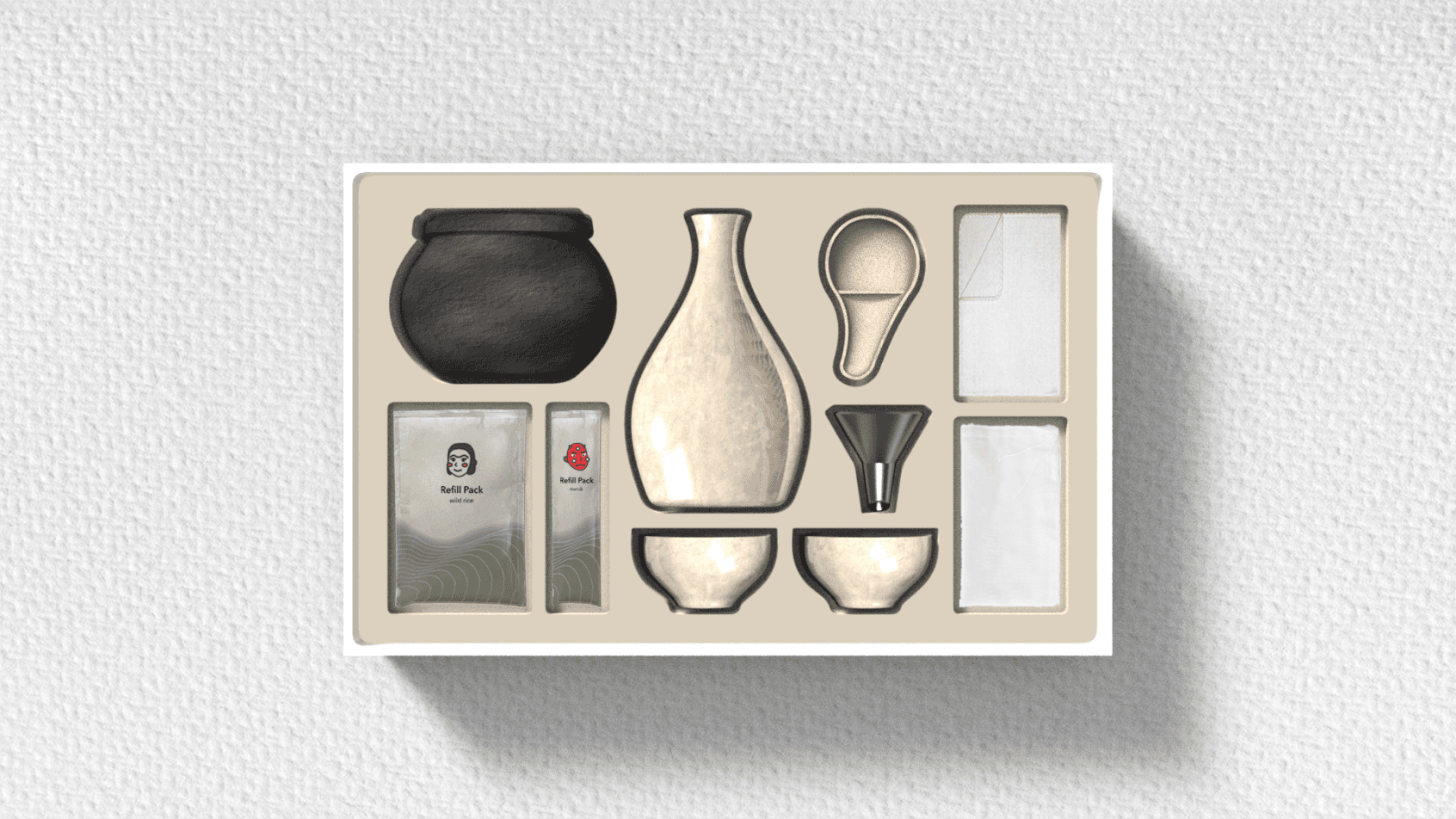
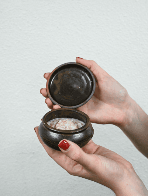
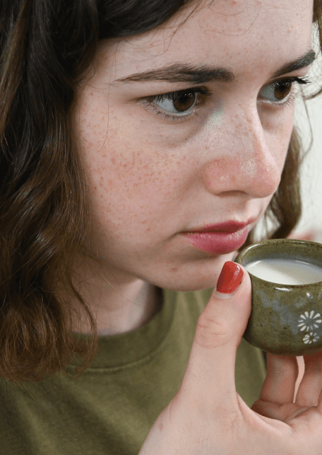
Taste the beauty by brewing your own Makgeolli in this all-in-one kit.

Taste the beauty by brewing your own Makgeolli in this all-in-one kit.

dal dal

dal dal

dal dal

Korean 달달 for “sweet”.

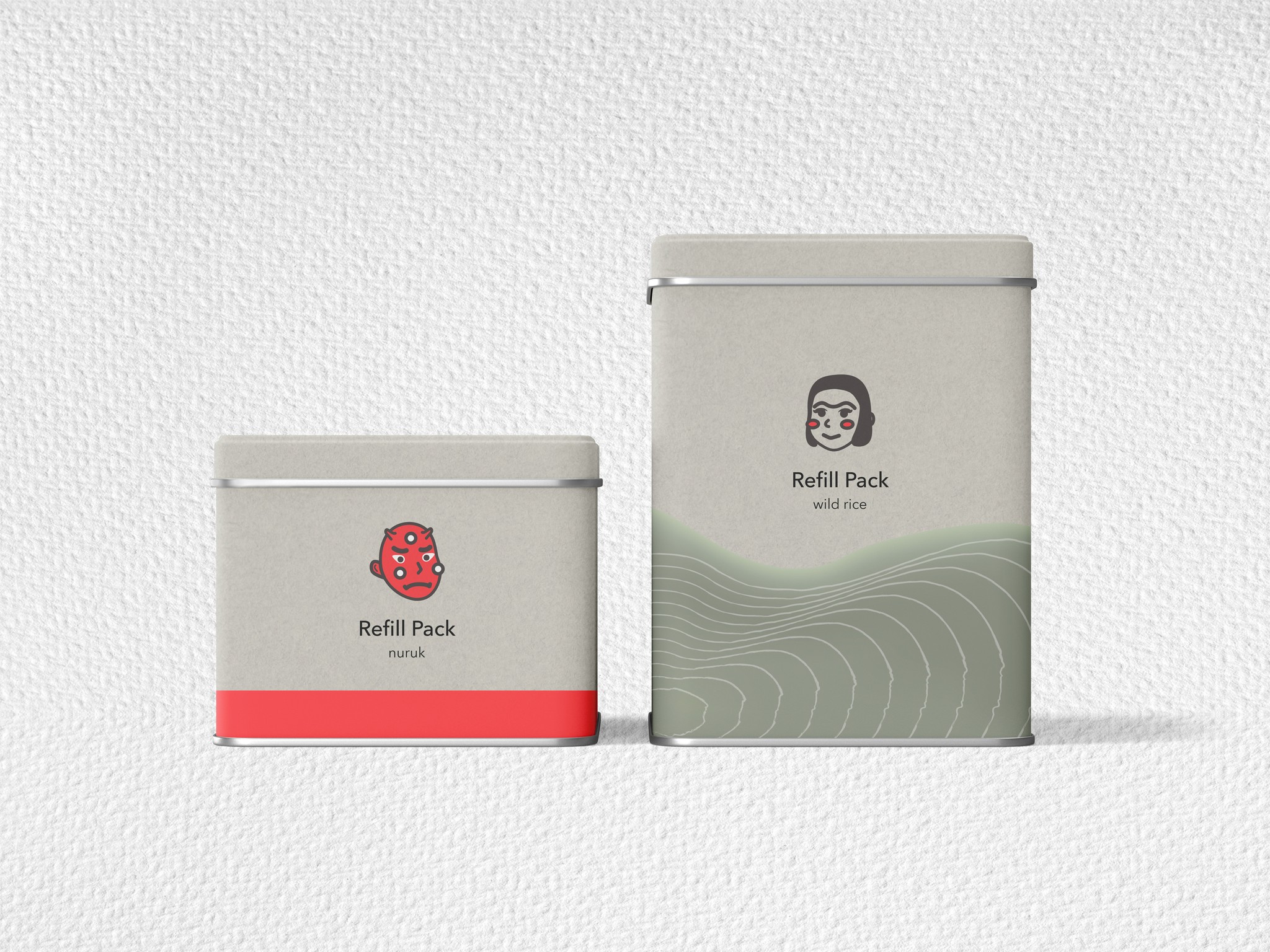
We provide beginner-friendly Suul-making kits with all necessary materials and ingredients for consumers to make Suul at home. Leftover rice from the Suul making process can be used for skincare purposes, ensuring that no product is wasted while simultaneously promoting a sustainable culture of Suul creation.

Brand Story

Our brand originates from the concern that too much lees was being wasted when making suul. We wanted to find a sustainable way to allow korean people to reconnect with their culture. This is why we decided to make a sweet makgeolli dessert kit that is also a diy skincare kit, turning the lees into skincare.

Who we are?

Who we are?

Who we are?

Mission

Mission

Educate and make suul-making more accessible.

Educate and make suul-making more accessible.

Vision

Vision

Promote altogether mindful consumption, sustainability and korean culture.

Promote altogether mindful consumption, sustainability and korean culture.

Value

Value

Sustainability and accessibility.

Sustainability and accessibility.

BRAND SENSES

BRAND SENSES

Jey Park (Core Customer One)

23 years old, University Student

Jey, a Gen-Z Korean, recently returned to Korea after living abroad for a decade to complete his studies. He has a strong passion for aesthetics and keeps up with the latest trends. Interested in exploring his home country's drinking culture, he faces challenges due to his busy schedule and limited purchasing power from his part-time job.

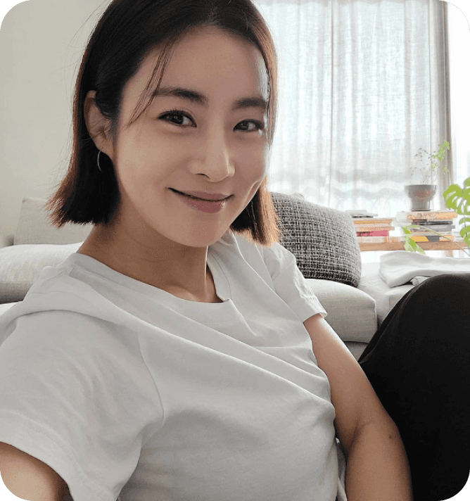
Kim Tae-Hi (Core Customer Two)

35 years old, Marketing Manager

Kim is a busy married parent of two young children, with a strong interest in skincare, traditional cooking, and sustainability. She holds high purchasing power but prioritizes convenience due to her limited free time. Kim actively seeks out environmentally conscious products and services that align with her values.

Hyesun House

Competitor One

Founded by a Korean American, it aims to bring the Korean tradition of Suul-making to the Western market. They are committed to spreading Korean culture and the rich heritage of makgeolli.

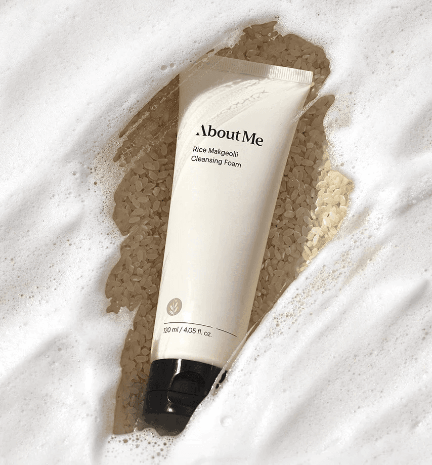
About Me

Competitor Two

This cosmetics brand has a strong focus on biomedical research to improve their products. They target a younger audience who are interested in affordable and innovative skincare and cosmetics.

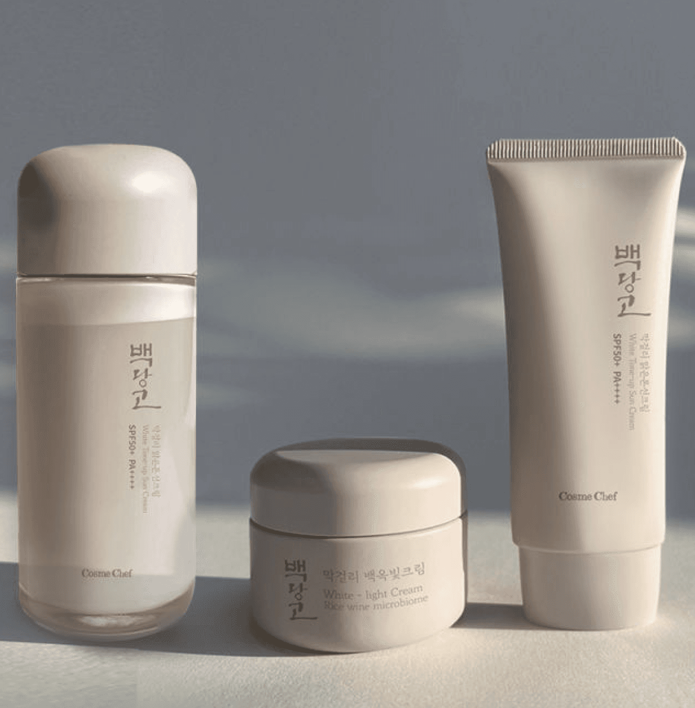
CosmeChef

Competitor Three

Korean cosmetic brand that aims to craft healthy and natural small batch cosmetics. Committed to using premium ingredients for their health and environmentally conscious target demographic.

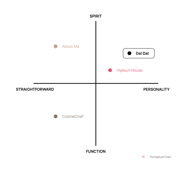
If we were to categorize our brand, we would say that it both has spirit and personality. When you hear the name daldal, you don’t know what it will be about right away but you can guess that it’s going to be sweet and fun. Which is exactly what we are trying to convey with our visual identity.


Target Market
Younger consumers with sustainable lifestyle goals who want an affordable and fun experience of enjoying Korean tradition by making their own dessert Makgeolli and skincare products.

Age Range
18 - 35 Years Old


Price Range
20 - 30 USD

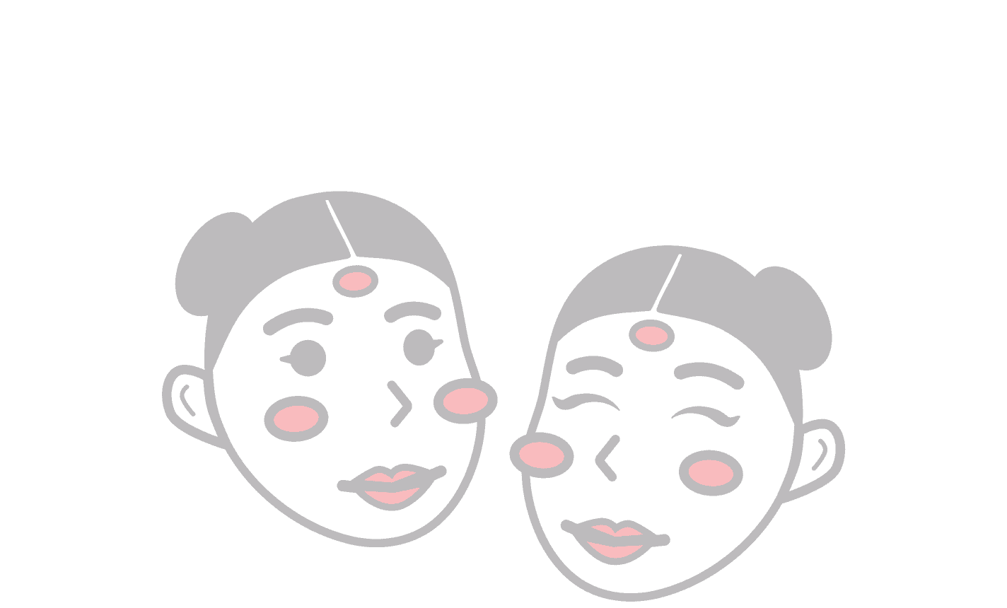
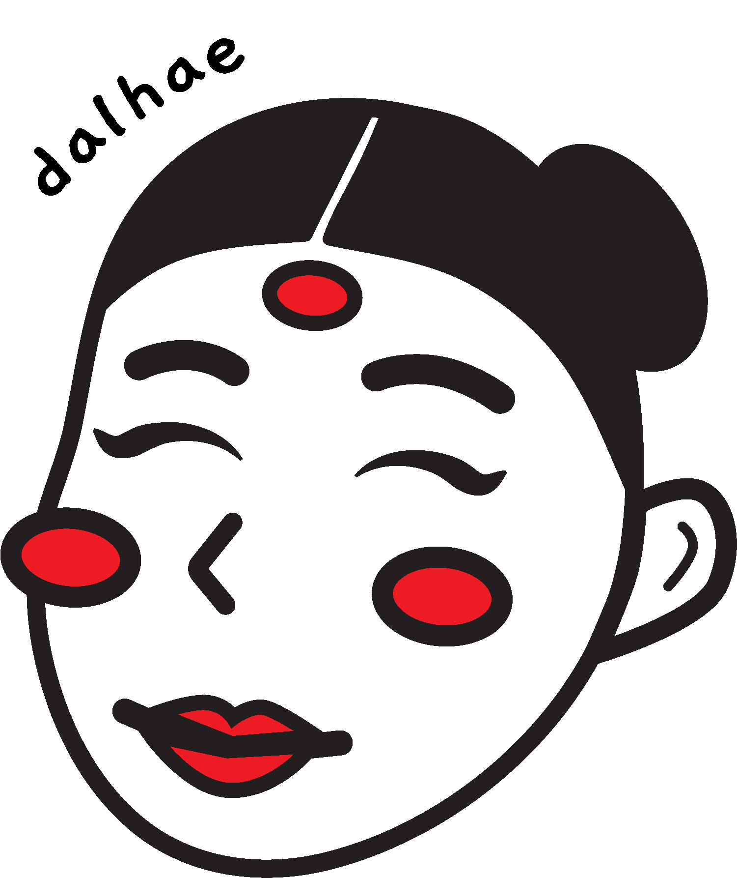
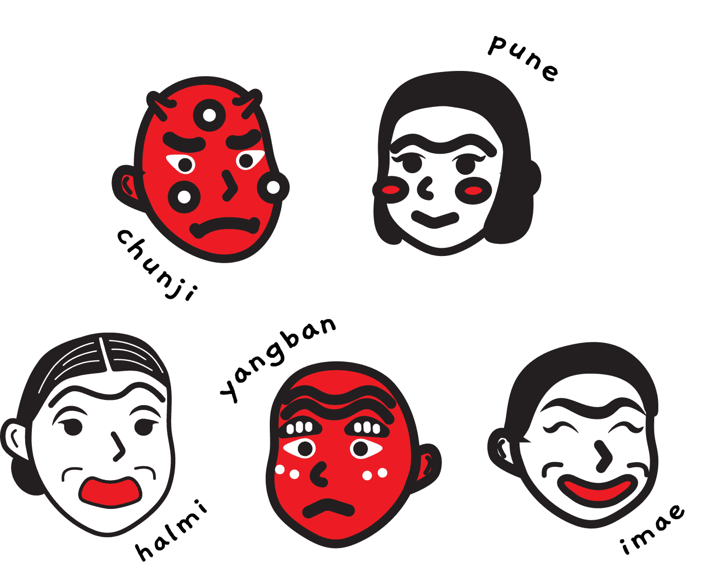
Our logo is inspired by Korean culture and the traditional Korean masks, Tal, used in mask dances, Talchum. It represents the heritage of suul-making, but also the skincare aspect of our DIY kit, akin to face masks.

The logo adopts a cartoon style to accompany the logotype, exuding a fun and bubbly character. This signifies giving tradition a modern and trendy twist, in hopes of targeting our main consumers, the younger demographic.

Logomark

We chose the name ‘daldal’, which means sweet in Korean. It is straightforward, catchy and easy to pronounce and remember. It conveys our brand’s message of sweetness and satisfaction.

We chose the font ‘Gaegu’ in the wordmark. The playful and handwritten style of the type face gives a sense of character and personality to our brand, which complements well with the Logomark.

Wordmark

Our brand tagline that accompanies the Wordmark and Logomark is ‘taste the beauty’. It represents an enjoyment of both the sweet-tasting dessert Makgeolli and skincare aspects of our brand.

We hope to deliver the deeper message of appreciating both the taste and the skincare benefits of Suul-making through the beauty of sustainability, novelty and personalisation through our DIY Suul kits.

Tagline

Description
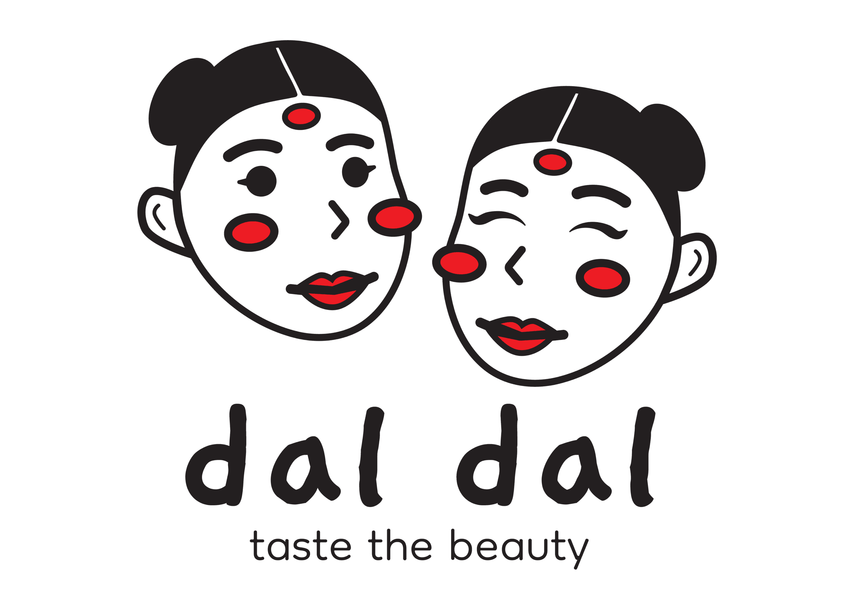
The primary logo which represents the essence of the brand and its products. It consists of the Logomark, Wordmark and Tagline.

Application Guidelines
The full version of the logo should be used as the focus or central element as it conveys the strongest brand message and identity.

Safe Space
The X-height of the logo is the letter height of a lowercase ‘a’ in the wordmark. A border of 2 x-heights is used around the entire Logo.

Description
Our Logomark is a reduced form of the full logo and is a brand symbol. It acts as a visual representation of our brand and lends it personality.

Application Guidelines
It should be used in tight spaces or more constrained layouts. It can also be used as a graphic element on products and marketing material.

Safe Space
The logomark has an X-height of 2 letter heights of a lowercase ‘a’ in the wordmark.

Description
The Wordmark is short and distinctive form of our logo that features the catchy and memorable brand name as well as the tagline.

Application Guidelines
It should be used for more formal and minimal applications where context on the brand name is needed.

Safe Space
The wordmark has an X-height of the letter height of a lowercase ‘a’.

Horizontal Logo
The logomark is placed horizontally next to the wordmark. This is most suitable for longer applications on wider landscape layouts.

Horizontal Logo
The logomark is placed horizontally next to the wordmark. This is most suitable for longer applications on wider landscape layouts.

Vertical Logo
A playful variation of our Wordmark on our Logomark. Used as a reduced full logo for compact layouts. It is available in our English and Korean brand name.

Vertical Logo
A playful variation of our Wordmark on our Logomark. Used as a reduced full logo for compact layouts. It is available in our English and Korean brand name.

Primary Colours

Primary Colours

Our colour palette pays homage to the vibrant world of Korean traditional masks, where colours of black, red, white, and white come together in harmony.

Black #221F20
The colour represents the beauty of Asian black hair and evokes qualities of elegance, resilience, and alluring charm.

Red #D22E2D
The colour red represents health, vibrancy, and a natural glow, aligning with our brand's focus on promoting radiant and lively complexion.

White #FFFFFF
The colour symbolises purity and a fresh start, reflecting our brand's focus on gentle and effective skincare solutions.

Secondary Colours

Secondary Colours

Beige conveys a sense of calmness, neutrality, and subtlety.

Often associated with tranquillity, comfort, and warmth, we chose a versatile and timeless colour palette that can evoke a feeling of simplicity, elegance, and natural beauty.

Beige conveys a sense of calmness, neutrality, and subtlety.

Often associated with tranquillity, comfort, and warmth, we chose a versatile and timeless colour palette that can evoke a feeling of simplicity, elegance, and natural beauty.

#E0DED2

#BFB3A3

#CBC7BC

#AFA99B

#D3BEA9

#899785

Primary Characters

Secondary Characters

Other Assets

Primary Characters

Secondary Characters

Other Assets

MIDDLE GROUND

MIDDLE GROUND

Primary Characters

Secondary Characters

Other Assets

Horizontal Logo
The logomark is placed horizontally next to the wordmark. This is most suitable for longer applications on wider landscape layouts.

Vertical Logo
A playful variation of our Wordmark on our Logomark. Used as a reduced full logo for compact layouts. It is available in our English and Korean brand name.